
Merging B2B tools
A consolidation of two existing tools into a brand new web application and a look into one of the most used features
OVERVIEW
I was tasked with merging two existing B2B web applications into a new, unified solution to streamline workflows. Both tools managed commercial real estate asset lifecycles: one analyzed which equipment assets (ex. HVACs, heat pumps) to replace, and the other prioritized replacements within client budget limitations.
MY ROLE
As the sole designer, I owned the full lifecycle of the new web application— from research and information architecture to wireframing, prototyping, user testing, and final UI specifications—while partnering closely with product management and engineering to bring the product to launch.
Discovery
Gathering user feedback and business goals to understand the existing problems
Business goals
The goal was to combine two existing tools into one streamlined platform to improve efficiency and reduce the cost and effort of maintaining multiple systems.
User analytics & user interviews
I partnered with the Product Manager to analyze usage data and determine which features were most critical across both tools.
I then conducted in-depth user interviews to uncover how users integrated the tools into their workflows, what were important to them, and what were their pain points and needs.
Combining quantitative and qualitative insights, we aligned on the core functionality required for the MVP.
Who are the primary users?
User background:
The primary users are internal professionals, such as Reliability Engineers, who act as trusted advisors to their clients.
Their role involves monitoring large portfolios of equipment assets and recommending which assets should be replaced as part of the client’s budget planning process.
“With thousands of assets and a limited budget, how do I effectively prioritize and recommend assets for replacement to my clients?”
Cameron, Reliability Engineer (internal company staff)

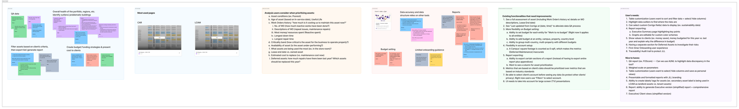
User research findings
I translated the user research findings into a comprehensive visual system map and research summary outlining usability gaps, pain points, and opportunities—creating a foundational document that guided stakeholder alignment and product decisions throughout development.
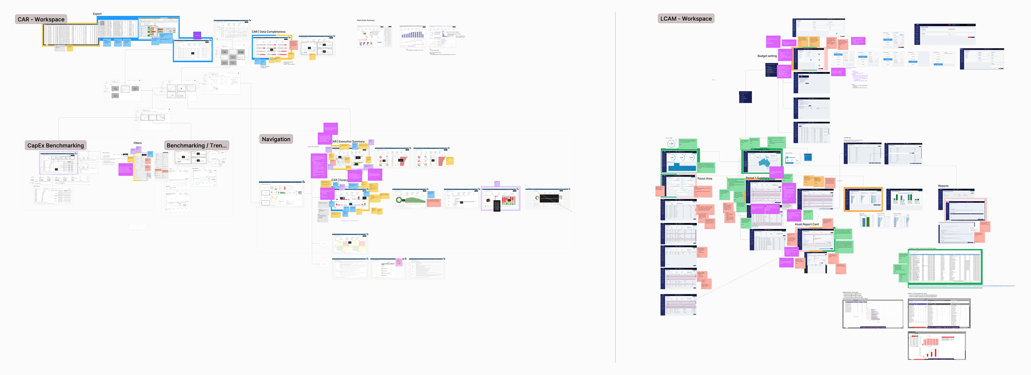
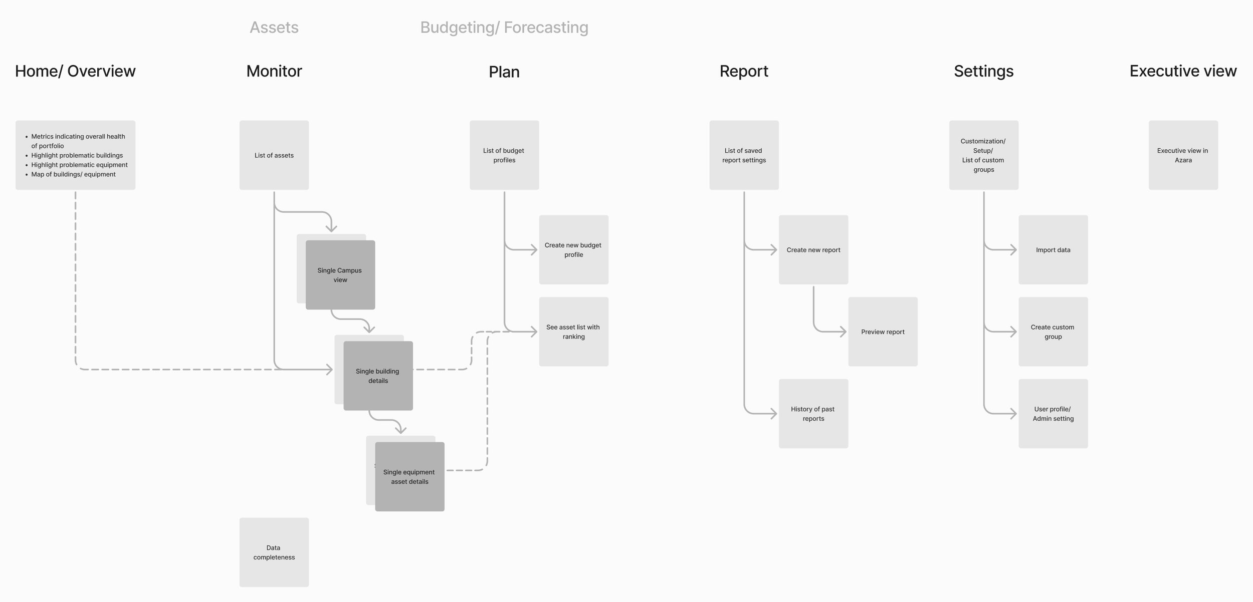
Information architecture
Once the MVP scope was defined, I established the information architecture to create a cohesive and unified experience across the new tool.
I then conducted deeper exploration into high-impact features to uncover usability issues and user needs. The asset detail view, one of the most heavily used features, became a key focus area.
The example below walks through the design process for reimagining the asset detail view experience.
Problem on asset detail view
Currently, users utilize other tools to gather additional information about an asset. How might we provide a holistic view of the asset without overwhelming users?
Users want to keep track of decisions on an asset to communicate with clients effectively. How might we provide an audit trail for easy reference and accountability?
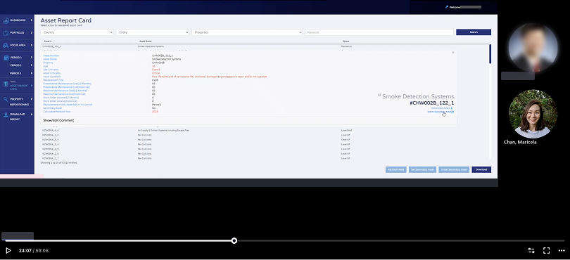
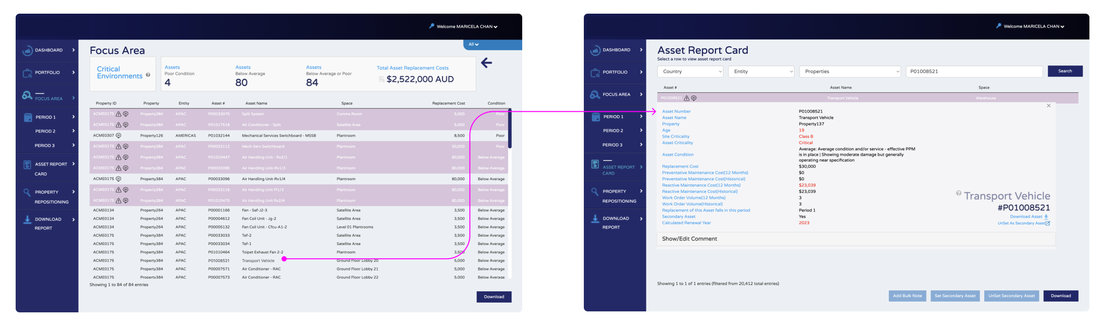
Legacy asset detail view
The legacy “Asset report card” and flow was documented here for reference.
Ideation
Brainstorming and testing out solutions quickly
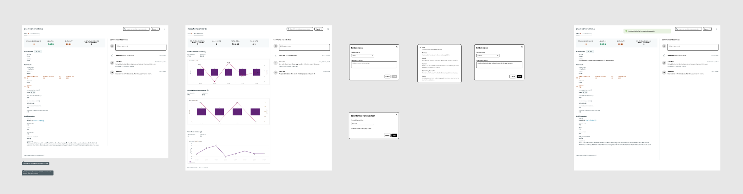
WIREFRAMING
I developed wireframes based on user pain points and needs. The wireframes were turned into a clickable prototype for user testing.
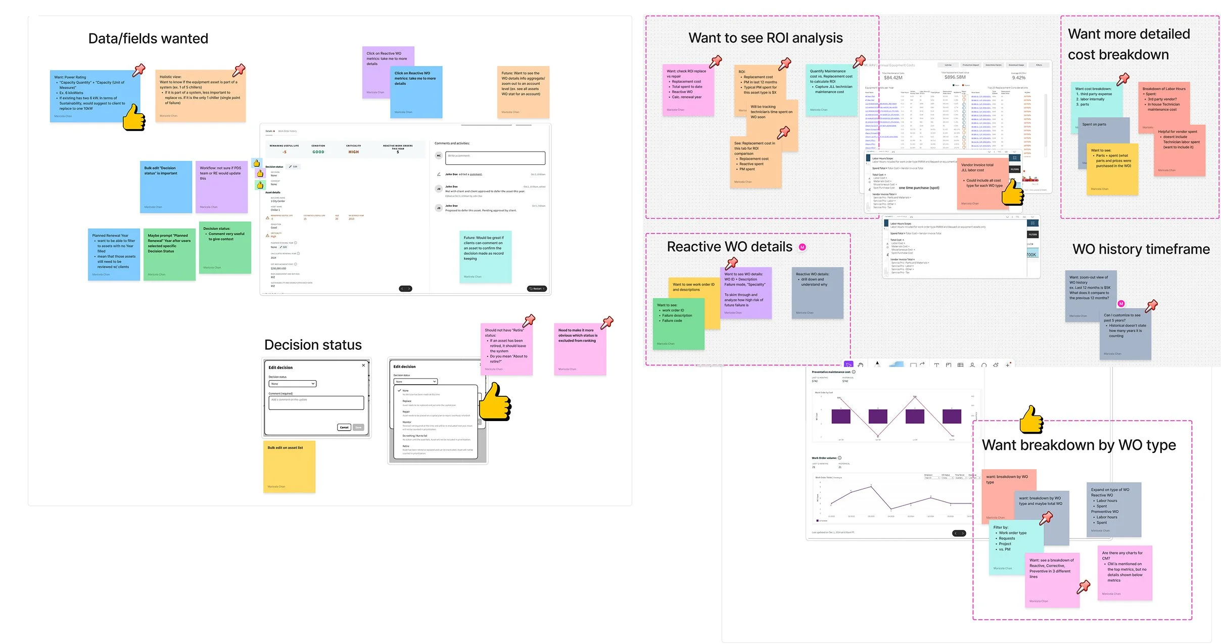
USABILITY TESTING
Based on user feedback on the wireframes, I generated post-it notes and organized the feedback into themes. This was presented to key stakeholders. The artifact was impactful as key stakeholders often revisit this as a reference.
FINAL DELIVERABLES
After aligning the designs with all stakeholders (Product and Engineering), I developed high-fidelity designs following company’s design system. I collaborated with engineers to implement the final designs. When a build was ready, I worked with engineers on design QA.
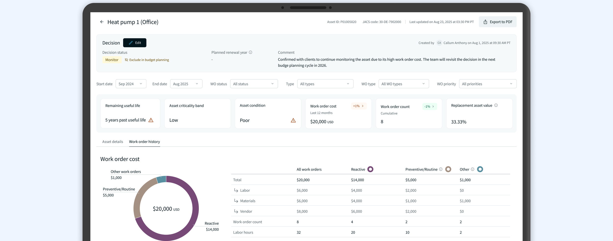
Goal — One-stop shop to improve efficiency and accountability
The final UIs were created referencing company’s design system to ensure a cohesive experience across all platforms.
From high-level view to detailed view
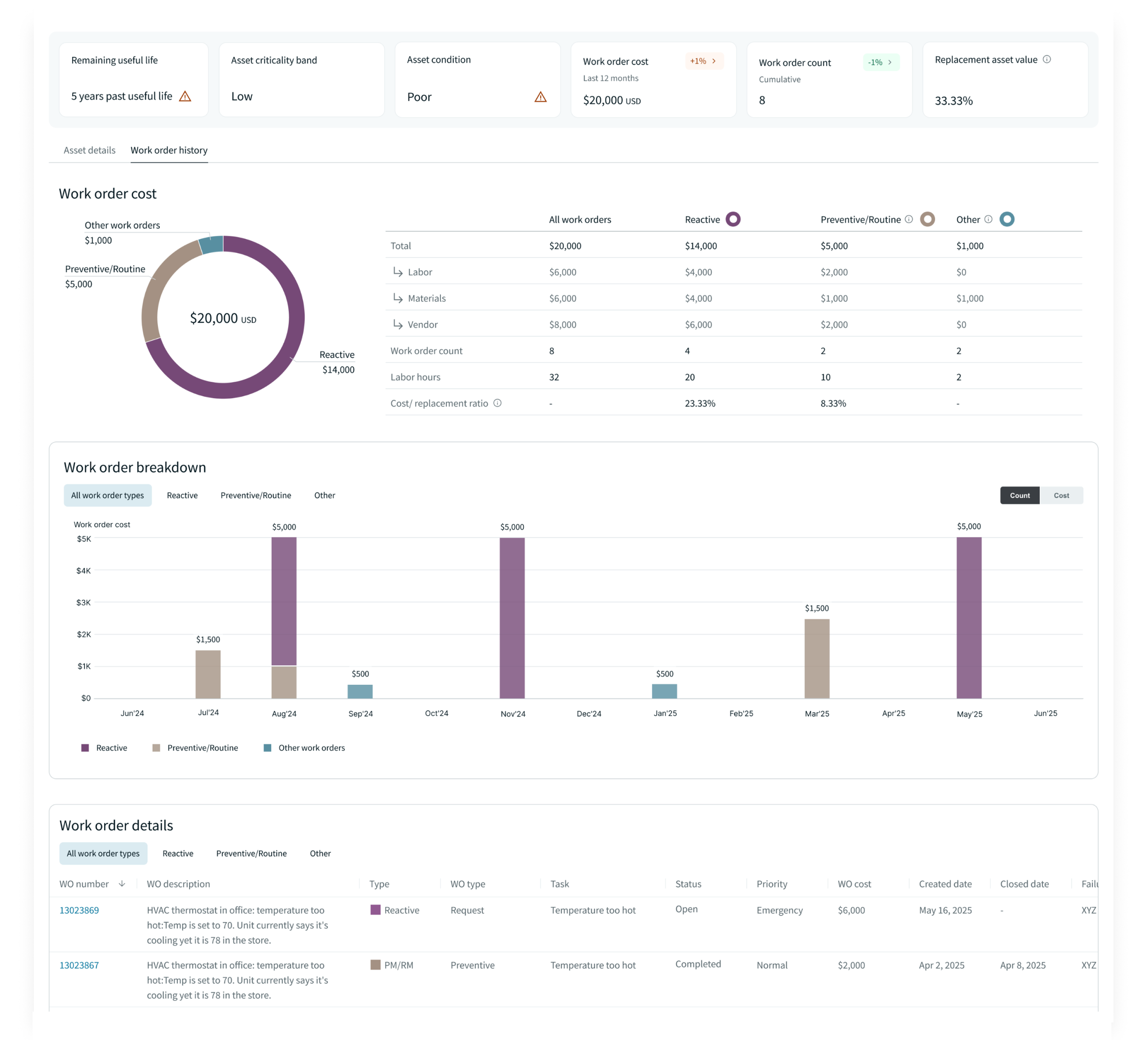
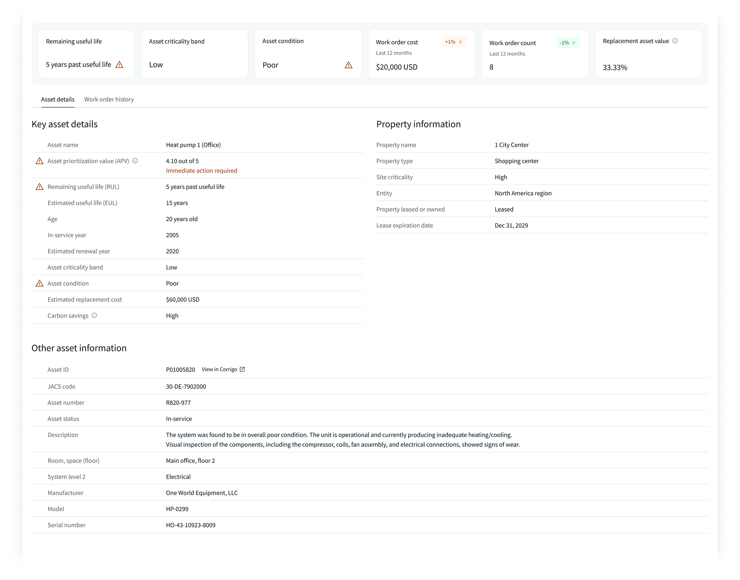
User interviews revealed that evaluating an asset’s future risk of failure required access to detailed information about past works and repairs. With the legacy tool, users had to switch to another application to gather this information, creating inefficiencies and slowing decision-making.
Solutions
The redesigned asset detail view consolidates works and repair information directly within the application. The layout is organized to support easy comparison between different types of works and repairs. A high-level summary at the top provides a quick overview of the most important work types, while a detailed section at the bottom allows users to dive deeper when needed. This approach enables faster, more informed decision-making without context switching.
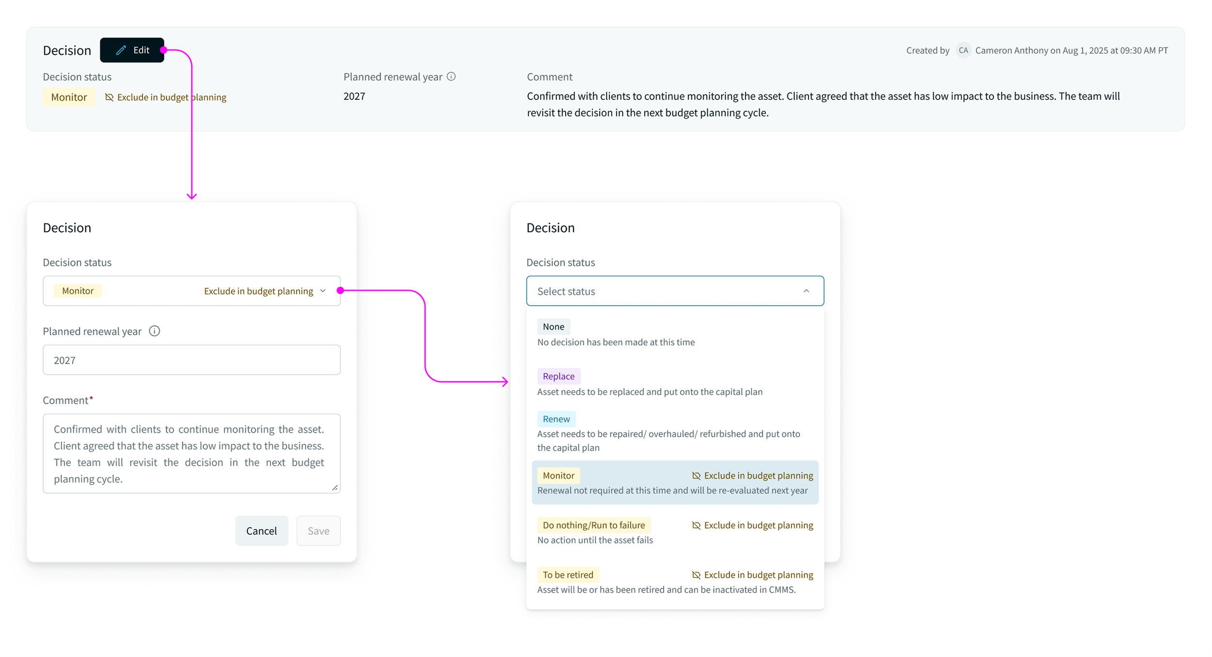
Audit trail to improve communication
Previously, users used comments to keep track of an asset’s decision. Comments were hidden under a click and easily missed.
Solutions
In the new design, a new "decision" section provides an audit trail on asset decisions. Users can keep track of the approval history easily for more effective communication with clients.
All the details you need—one click away
Research findings showed that users needed to switch between multiple applications to collect the information required to evaluate asset replacement. This fragmented process slowed down workflows and made the process more prone to errors.
Solutions
In the redesigned experience, I surfaced additional asset details that help users evaluate replacement decisions more effectively. High-demand data requested by clients was prioritized and displayed at the top, while values outside normal ranges were visually highlighted to enable quick scanning.
Information was structured into clear, digestible sections to improve organization and readability. This approach ensures users have the key data and supporting evidence needed to confidently back up their recommendations.
Impact and outcome
Business
Post-redesign user interviews revealed meaningful business impact. Users reported that the streamlined experience allowed them to evaluate assets faster and deliver replacement recommendations to clients more efficiently. The new “decision” feature was highlighted as a major improvement, enabling clearer communication with clients and supporting stronger client relationship management.
What I learned
Industry-specific context
Some data fields—such as “Asset Prioritization Value”—are highly specific to the asset management industry. While I made efforts to understand the context behind each field, new requirements were occasionally introduced late in the design process. Rather than simply adding them to the interface, I conducted quick, informal validation with users.
By sharing UI designs through chat, users—who were already familiar with the data—provided fast, actionable feedback. This lightweight feedback loop helped ensure the designs accurately reflected the data while enabling the team to move forward quickly without delaying product or engineering timelines.
Keep new features lean
For the new “decision” feature, the team prioritized launching a lean MVP that addressed the core user need. Although we conducted user research and testing, we knew that true behavior patterns would only emerge after release.
By keeping the feature simple at launch, we were able to gather real usage data and iterate quickly. This approach helped the team avoid over-investing in enhancements before validating how users interact with the feature in real-world scenarios.